Accessibility Is Not a Feature — It's the Product
Accessibility Is Not a Feature — It's the Product
I watched a blind developer try to use a web application I'd built. He tabbed through the page while a screen reader announced what it encountered. What I heard was: "Link. Link. Button. Graphic. Graphic. Link. Button."
No labels. No headings. No landmarks. A page that looked beautiful and functioned perfectly for sighted users was, for him, a wall of unlabeled interactive elements with no structure, no hierarchy, and no way to understand what anything did.
That was four years ago, and it fundamentally changed how I think about building software.
The Numbers Should Embarrass Us
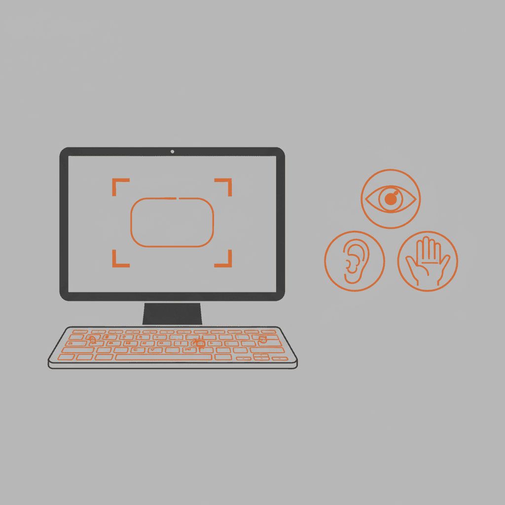
1.3 billion people — 16% of the global population — experience significant disability. That includes 285 million people with visual impairments, 466 million with hearing loss, and hundreds of millions with motor, cognitive, and neurological disabilities.
Yet a 2024 WebAIM study found that 96.3% of the world's top million home pages have detectable WCAG failures. Not subtle issues that require expert review — detectable failures that automated tools can catch. Low-contrast text. Missing alt text. Empty links. Missing form labels.
96.3%. That means if you picked a random website, there's less than a 4% chance it meets basic accessibility standards.
This isn't a technical limitation. We've known how to build accessible websites since the Web Content Accessibility Guidelines were first published in 1999. This is a choice — usually an unconscious one, made by teams that never included accessibility in their definition of "done."
Accessibility Is Simpler Than You Think
Most developers imagine accessibility as a massive, specialized effort requiring expert knowledge and expensive audits. The reality is that 80% of common accessibility failures can be fixed with basic HTML literacy.
Use Semantic HTML
This single practice eliminates more accessibility issues than any framework, plugin, or ARIA attribute.
<!-- Bad: A div pretending to be a button -->
<div class="btn primary" onclick="submit()">Submit</div>

<!-- Good: An actual button -->
<button type="submit" class="btn primary">Submit</button>
The <button> element is focusable by default. It responds to Enter and Space key presses. Screen readers announce it as a button. It works with voice control software. The <div> does none of this without significant additional work.
Similarly:
- Use
<nav>for navigation, not<div class="nav"> - Use
<main>for main content, not<div id="content"> - Use
<h1>through<h6>in order, not styled<div>or<span>elements - Use
<ul>and<li>for lists, not a series of<div>elements with bullet characters
Screen readers use these semantic elements to build a structural model of your page. Without them, the user gets a flat stream of text and links with no hierarchy.
Write Meaningful Alt Text
Every image needs an alt attribute. But not every image needs descriptive alt text.
Informative images need alt text that conveys the same information the image provides:
<img
  src="revenue-chart.png"
  alt="Revenue grew from $1.2M in Q1 to $2.8M in Q4, with the steeper growth in Q3."
/>
Decorative images should have empty alt text so screen readers skip them:
<img src="decorative-wave.svg" alt="" />Images of text should have alt text matching the text in the image (or better yet, don't use images of text).
The cardinal sin is alt="image" or alt="photo.jpg". That's worse than no alt text because it actively wastes the user's time by announcing useless information.
Label Your Forms
Every form input needs a label. Not a placeholder — a label.
<!-- Bad: Placeholder disappears when user starts typing -->
<input type="email" placeholder="Email address" />

<!-- Good: Label is always visible and associated -->
<label for="email">Email address</label>
<input type="email" id="email" />
Placeholders are not labels. They disappear on focus, they have insufficient contrast by default, and screen readers don't reliably treat them as labels. Use them for examples or hints, not as the primary identifier of a form field.
Manage Focus
When something on the page changes — a modal opens, an error appears, content loads dynamically — make sure the user's keyboard focus goes to the right place.
A sighted user sees the modal appear and naturally looks at it. A keyboard user needs focus explicitly moved to the modal. When the modal closes, focus should return to the element that triggered it.
// When opening a modal
const modal = document.getElementById("modal");
modal.setAttribute("role", "dialog");
modal.setAttribute("aria-modal", "true");
modal.focus();

// When closing, return focus to trigger
triggerButton.focus();
This focus management is the difference between a usable and unusable experience for keyboard and screen reader users.
Color Is Not Enough
If you use color alone to communicate information, you're excluding people with color vision deficiencies — roughly 8% of men and 0.5% of women.
Don't do this:
- Red text to indicate errors without any other indicator
- Green/red to show status (active/inactive) without labels
- Charts that rely solely on color to distinguish data series
Do this instead:
- Combine color with text labels, icons, or patterns
- Use sufficient contrast ratios (4.5:1 for normal text, 3:1 for large text)
- Test your UI with a color blindness simulator (Chrome DevTools has one built in)
Keyboard Navigation Isn't Optional
Some users can't use a mouse. Period. Whether due to motor disabilities, injury, or personal preference (many power users prefer keyboard navigation), your application needs to be fully operable via keyboard.
Test this yourself right now: try using your app with only the Tab key, Enter, Space, and arrow keys. Can you:
- Navigate to every interactive element?
- See where focus is at all times? (visible focus indicator)
- Open and close menus?
- Submit forms?
- Dismiss modals?
If you got stuck anywhere, keyboard users are stuck there permanently.
The most common killer: custom components that look interactive but aren't focusable. Custom dropdowns built from <div> elements. Accordion panels that only respond to mouse clicks. Drag-and-drop interfaces with no keyboard alternative.
Testing Accessibility
You don't need to be an expert to test for accessibility. Here's a tiered approach:
Tier 1: Automated Tools (10 minutes)
- Run axe DevTools (browser extension) on every page
- Run Lighthouse accessibility audit
- These catch about 30-40% of issues — the low-hanging fruit
Tier 2: Manual Keyboard Testing (30 minutes)
- Tab through every page
- Verify visible focus indicators
- Test all interactive elements with keyboard only
- Check that focus order is logical
Tier 3: Screen Reader Testing (1 hour)
- Use VoiceOver (Mac), NVDA (Windows), or TalkBack (Android)
- Navigate by headings — do they form a logical outline?
- Try to complete core user flows without looking at the screen
Tier 4: User Testing
- Include people with disabilities in your user testing
- This is where you discover the issues no tool or technique can catch
The Business Case (If You Need One)
Accessibility isn't just ethical — it's profitable.
- Market size: 1.3 billion people with disabilities have collective spending power of $1.9 trillion annually
- Legal exposure: Web accessibility lawsuits increased 320% between 2018 and 2023 in the US alone
- SEO benefit: Semantic HTML and good heading structure directly improve search engine rankings
- Universal benefit: Captions help people watching video in noisy environments. Keyboard navigation helps power users. High contrast helps everyone reading in sunlight.
Making It Stick
The only way accessibility becomes durable is if it's part of your definition of done. Not a phase. Not a quarterly audit. Not a separate ticket type.
Add these to your pull request checklist:
- All images have appropriate alt text
- All form inputs have associated labels
- All interactive elements are keyboard accessible
- Color is not the sole means of conveying information
- New components have been tested with a screen reader
- axe DevTools shows zero violations
It's not extra work — it's the work. The same way you don't ship code without tests, you shouldn't ship interfaces without accessibility. Because an interface that 16% of the world can't use isn't a feature-complete product. It's a broken one.